Booking.com photos: the main photo, the order, and the details that convert
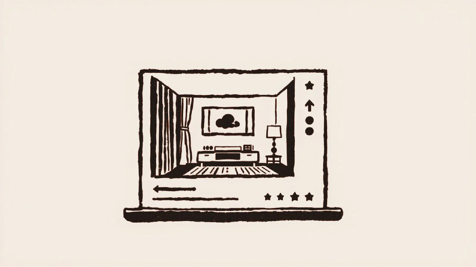
Booking.com photos get bookings when they let a guest understand your property in a few seconds, on a phone, among dozens of other options. That takes three things: a main photo that still reads as a small thumbnail, a gallery in a logical order, and details that answer questions instead of only setting a mood. This guide covers all three, plus the settings in the Booking.com Extranet (where you manage your listing) that decide what guests actually see.
Two agriturismi (farm stays) near Lucca can sell the same kind of room at the same price and still have very different summers: one is nearly full, the other keeps cutting its rate. Often the difference is the photos.
How guests look at Booking.com photos
Booking.com works like a comparison shop, not like a travel magazine or your own website. A guest enters dates and a destination, gets a list of properties, and scrolls through it with a thumb. On each result the eye stops on the main photo for a moment. Then the guest decides: open the page or move on.
In that moment nobody reads your description, and nobody stops to admire the sunset. The guest asks one question, often without noticing: “Can I trust what I see?” If the answer is yes, they open your page. If the photo is dark, tilted, or hard to read, they keep scrolling.
The click matters for a second reason too. Booking.com says that to rank high in its default sort order, “Our top picks,” a property has to do well on clicks and bookings, and that those numbers depend on things like reviews, price, and the quality of your content, photos included. A main photo that earns the click helps you get seen, not only chosen.
Many of your guests also book from abroad. They can’t drive past to take a look, so your photos have to answer their questions for you, whatever language they speak.
Trust first, then beauty
On Booking.com your first goal isn’t to impress. It’s to reassure. Guests want to arrive and find exactly what they saw on the screen, with no surprises. A photo that works on Booking.com does three things at once:
- It’s clear. You can tell right away what you’re looking at: a double room, a full bathroom, breakfast in the garden.
- It matches the others. Same color temperature, same light, same style. A gallery that jumps from warm to cold and from bright to dark looks careless, and that worries someone who’s about to pay.
- It keeps its promise. It shows the real space, not an ultra-wide version that makes the room look bigger than it is. Booking.com’s photo guidelines advise against extreme wide-angle and fisheye shots.
On Booking.com a doubt doesn’t turn into a question. Nobody writes to ask what the room is really like: they book somewhere else. And a guest who’s disappointed at check-in is a bad review on its way. Review scores are one of the things Booking.com says its ranking depends on.
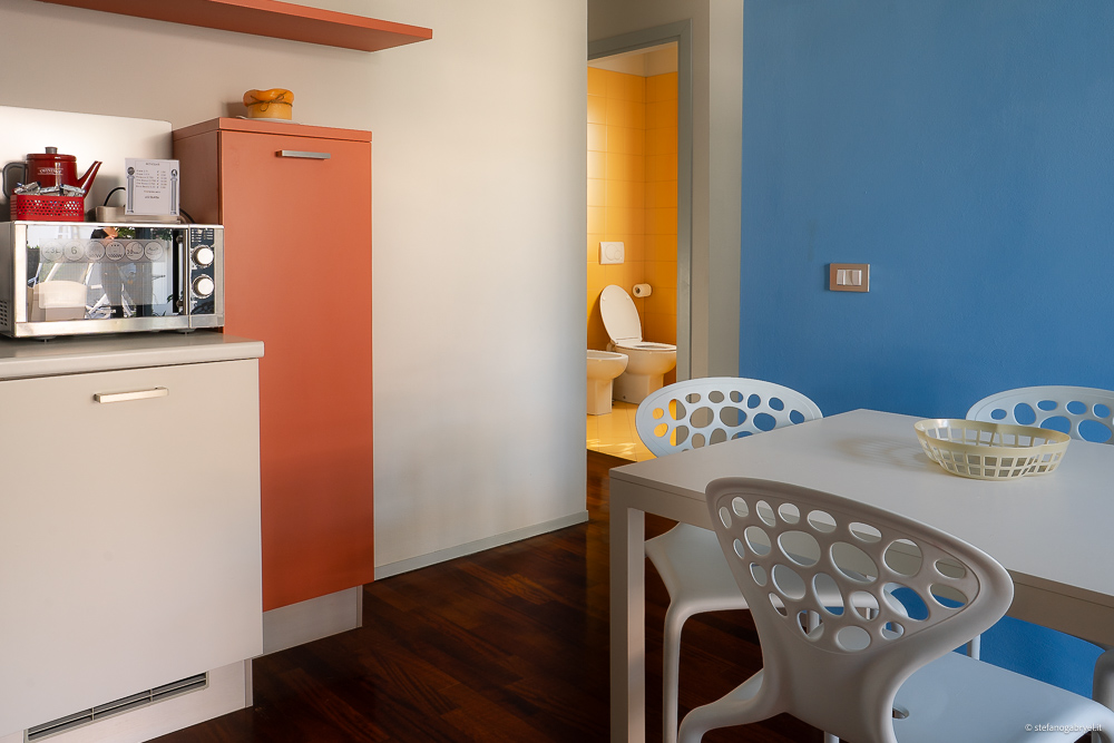
Your main photo: the one that wins the click
Your main photo is the one guests see in the search results, so it does most of the selling. Pick the most representative image that still works when it’s small: often the building in its landscape, the view, or your best room. Not the hallway, and not a detail shot.
Four things make it readable as a thumbnail:
- One clear subject, in the center. Booking.com asks you to keep the subject centered, and reminds you that the version in your Extranet gallery is already cropped.
- Landscape orientation. Booking.com asks for horizontal photos only.
- Daylight and straight vertical lines, so the space looks calm and real.
- Nothing competing for attention: no clutter, no text, no logo.
To set it, log in to the Extranet, go to Property > Photos, and drag your chosen photo to the “Preferred main photo” spot. If you don’t choose one, Booking.com uses the first photo in the gallery. Sizes and file limits are in Booking.com photo requirements, next to Airbnb’s and Google’s.
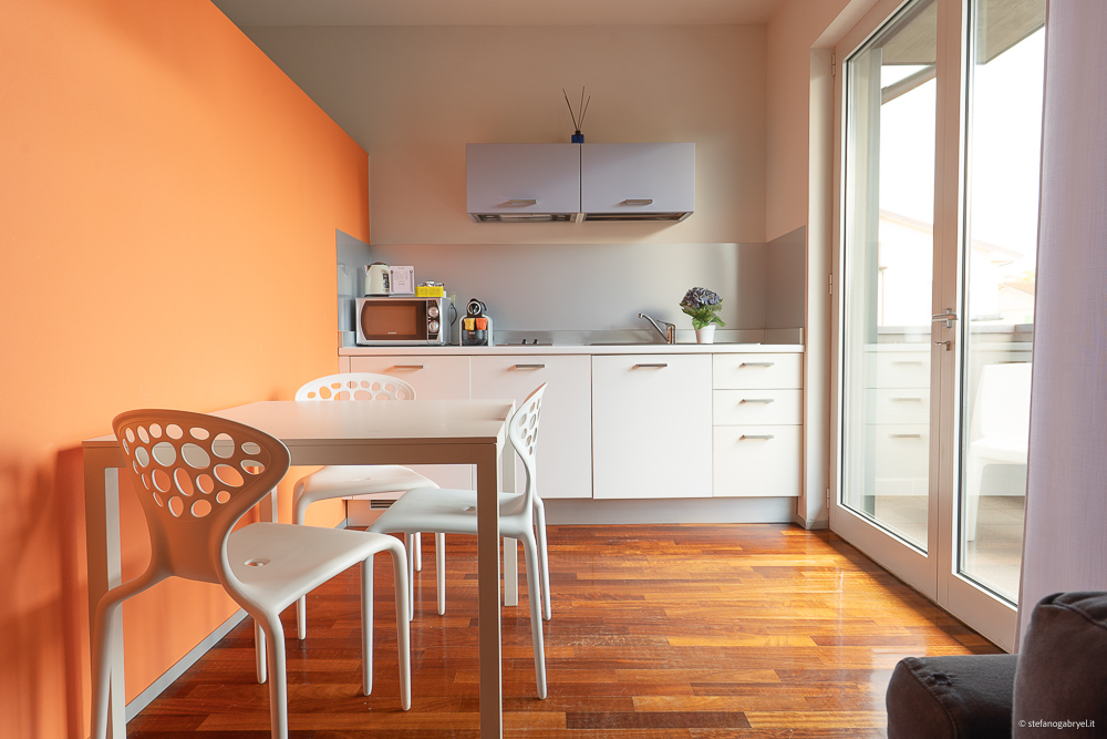
The order of your Booking.com photos
On Booking.com the order of the gallery matters almost as much as the quality of each photo, because it guides the guest through the property. This five-step sequence answers their questions one at a time:
- The main photo. Your most representative, readable image: the one that earns the click.
- The room. The space the guest is actually paying for, shown whole, in balanced light.
- The bathroom. One of the first things people want to check. Show it well and a big doubt disappears.
- Shared and outdoor spaces. Breakfast room, garden, pool, lounge.
- The setting. The village, the hills, the winery down the road. This is where you sell the experience, but only after you’ve reassured them.
Room, bathroom, shared spaces, setting: a logical flow that makes the guest think, “OK, I know what to expect.”
Check Smart ordering first
There’s a catch. Booking.com has a feature called Smart ordering that uses machine learning to arrange your gallery, and it’s on by default. While it’s on, guests see Booking.com’s order, not yours. If you’ve planned your sequence, go to Property > Photos, switch off the Smart ordering toggle under Main gallery, and drag the photos into place. If you leave it on, every photo has to work on its own, because you don’t choose what comes second.
Give each room type its own gallery
If you have more than one room or unit type, don’t stop at the main gallery. In the Extranet you can drag photos into each room’s own gallery. Booking.com asks for at least four photos of each room or unit, plus at least one of the bathroom and toilet, and says each room gallery should only show what that room type has. A guest choosing your double room with a garden view should see that room, not the suite upstairs. Changes to your Booking.com property photos can take up to 48 hours to appear.
Details that convert, and details that don’t
The last photos in the gallery are details, and many listings waste them. A remote control on the bedside table tells the guest nothing, and an artistic close-up of a flower adds mood but no information. Nobody books because of them.
A detail converts when it answers a question the guest has before booking:
- the bed, and how big it really is
- the shower and the towels
- the view from the window
- the parking space, if you have one
- the kitchen equipment, in an apartment
- the entrance, so guests arriving after dark can find it
- breakfast, set the way guests will find it
Quality details come last: fabrics, materials, the light in the room. They tell the guest the place is well kept, but they only work once the rest of the gallery has earned their trust.
Are your Booking.com photos doing their job?
Common mistakes in Booking.com listing photos
In the listings I review, the same problems come back again and again:
- Photos that don’t read as thumbnails. Too much in the frame and no clear subject. In the search results it looks like a blur, not a room.
- A random order. The pool, then a bathroom detail, then the outside again. The guest can’t build a picture of the place.
- A gallery that doesn’t match. Photos taken on different days and at different times, some with a phone and some with a camera, in colors that don’t go together. It’s the most underrated problem of all.
- Filters and watermarks. Booking.com’s guidelines advise against filters, strong contrast, oversaturated color, and heavy HDR, as well as collages, watermarks, and tilted or distorted photos.
- People as the subject. Booking.com recommends against photos where people are the main focus. Guests want to see the place.
Booking.com and Airbnb don’t want the same photos
The mistake I see most often is using the same gallery on every channel. But guests buy in a different way on each one, so the photos have a different job.
On Airbnb you mostly sell an experience and a mood: the warmth of the home, the personal touch, the story. On Booking.com you sell certainty and clarity first, because guests compare in a cooler, more rational way. Same set of photos, different selection, different order.
If you run a vacation rental or holiday let on Booking.com, Airbnb, and Vrbo at once, one shoot can feed all three, but each gallery needs its own edit. I cover the Airbnb side in my guide to Airbnb listing photos.
Do better photos mean more bookings on Booking.com?
They can, through three levers:
- Click-through rate: how many people open your page from the search results.
- Conversion: how many of those visitors go on to book.
- Price: how much value guests see, which decides whether you can hold your rate instead of discounting.
The first two feed the numbers Booking.com says its default ranking looks at (clicks and bookings), so better photos can also help you move up the list. The third protects your margin: when the photos show the value, you don’t have to compete on price alone. If you’re weighing the cost, I explain whether better photos are worth what they cost and where the return comes from.
A hypothetical, not a promise: for every 100 bookings you get today, a 5% lift in conversion means five more, from the same visitors and without spending anything on ads. And the photos keep working on every new search, for as long as they’re online.
Photos are one part of your listing
On Booking.com your photos work together with the rest of your listing: the facilities and room details you enter in the Extranet (Booking.com writes the main description from them), your reviews, and your price. Weak photos make complete details and great reviews earn less, and excellent photos on a neglected listing waste half their value.
The same photos should also work on your own website, where a booking pays no commission. That’s the other half of the job: how to get more direct bookings.
If you’d rather hand the job to a professional, ask for a shoot planned for Booking.com, not just a nice set of pictures: a main photo chosen for the thumbnail, a clear sequence, and one consistent edit. I explain how I work with hotels, B&Bs, and agriturismi on my hotel photographer in Tuscany page. The photos are yours to use everywhere, from Booking.com and Airbnb to your website and your Google Business Profile, in the right format for each channel.